Building Blocks Lacrosse
BBL is a lacrosse training and education company located in New Jersey. The academy offers a full range of classes for novice pre-K students all the way to D1 level recruits. They also offer travel clubs where boys and girls tryout and compete for different teams in different regions (Princeton, Shore, Central, Bergen County, Long Valley/Tewksbury, and BBL National). BBL offer training and competition for field lacrosse and the indoor version, box lacrosse. They believe that we can train & develop young athletes up in a step by step process to be able to perform lacrosse in the most advanced way.
"We Build Lacrosse Players"
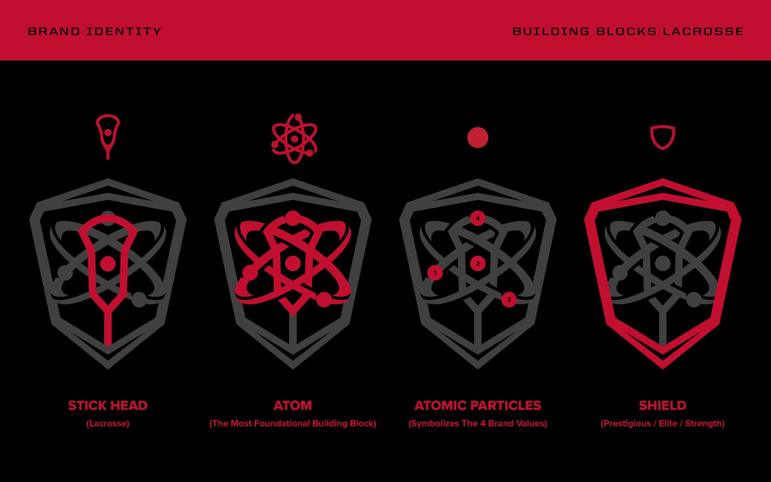
The tagline (above) describes what BBL does, distilled down to its simplest message, much like the atom is the simplest & most foundational building block. Integrating atom imagery into the visual branding made a lot of sense as it coincides with the scientific method of developing lacrosse players, step by step.
– Core Brand Values
Development & Leadership / Training & Growth / Respect, Patience & Support / Life Learners & Innovators
– Project Goals & Solution
Building Blocks Lacrosse never had a solidified visual identity that aligns with their brand so I set out to finally give BBL a strong & cohesive look across the board that will further boost brand equity indefinitely. We wanted to create a bold visual identity that is more in-sync with the BBL brand, resonates with the intended competitive & dedicated audience while injecting energy and creating a sense of pride amongst the players.
– Project Scope
Discovery & Research
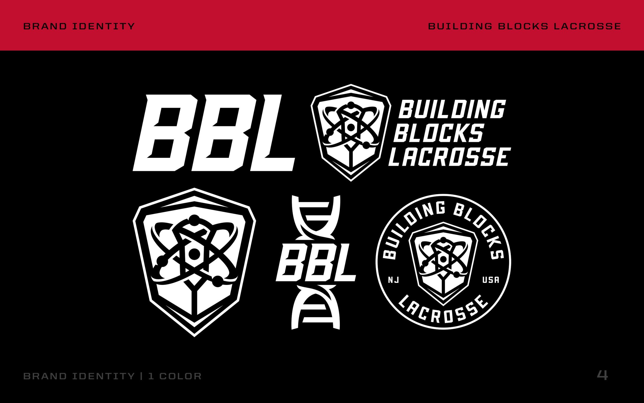
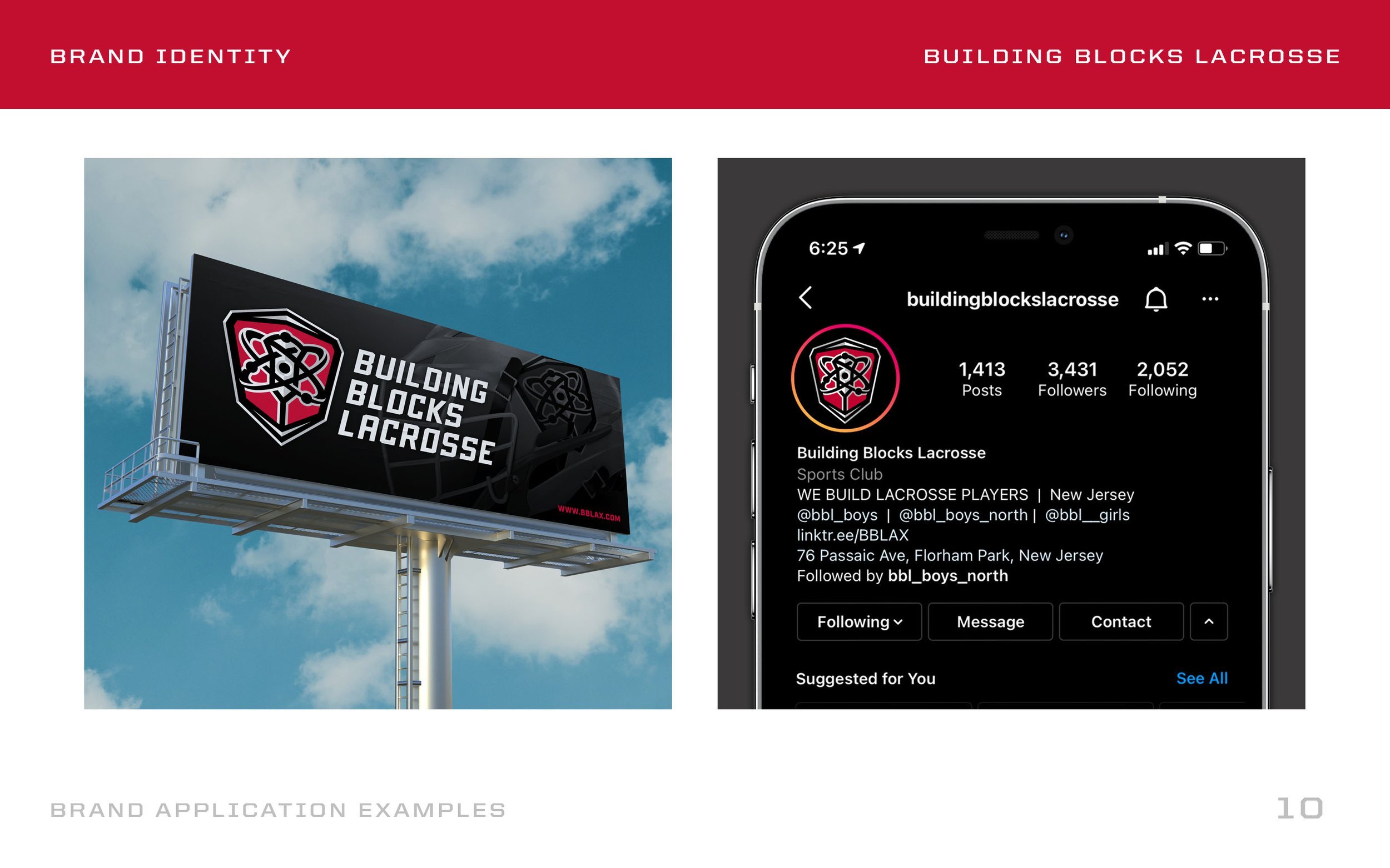
Primary Logo
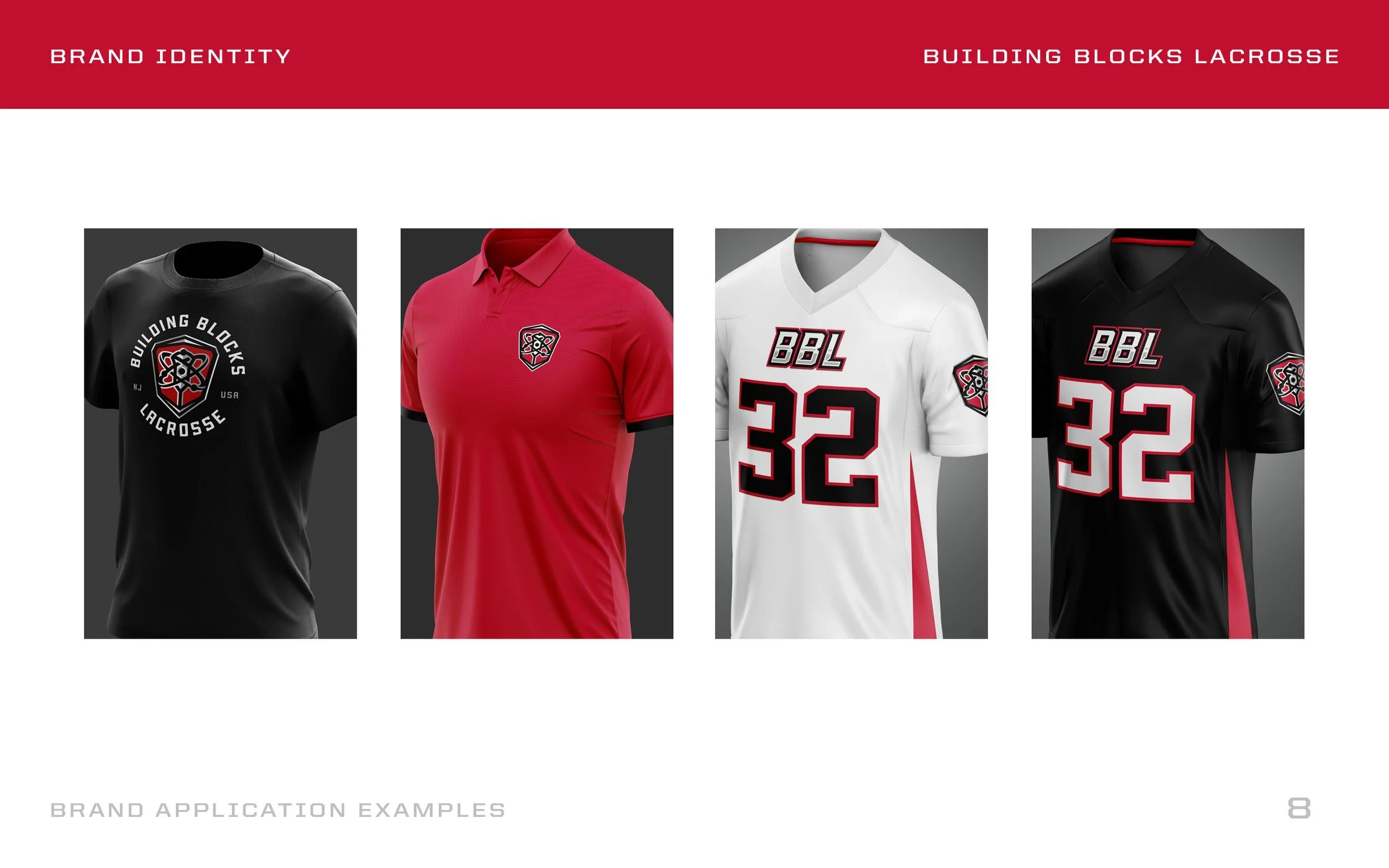
Badge Roundel
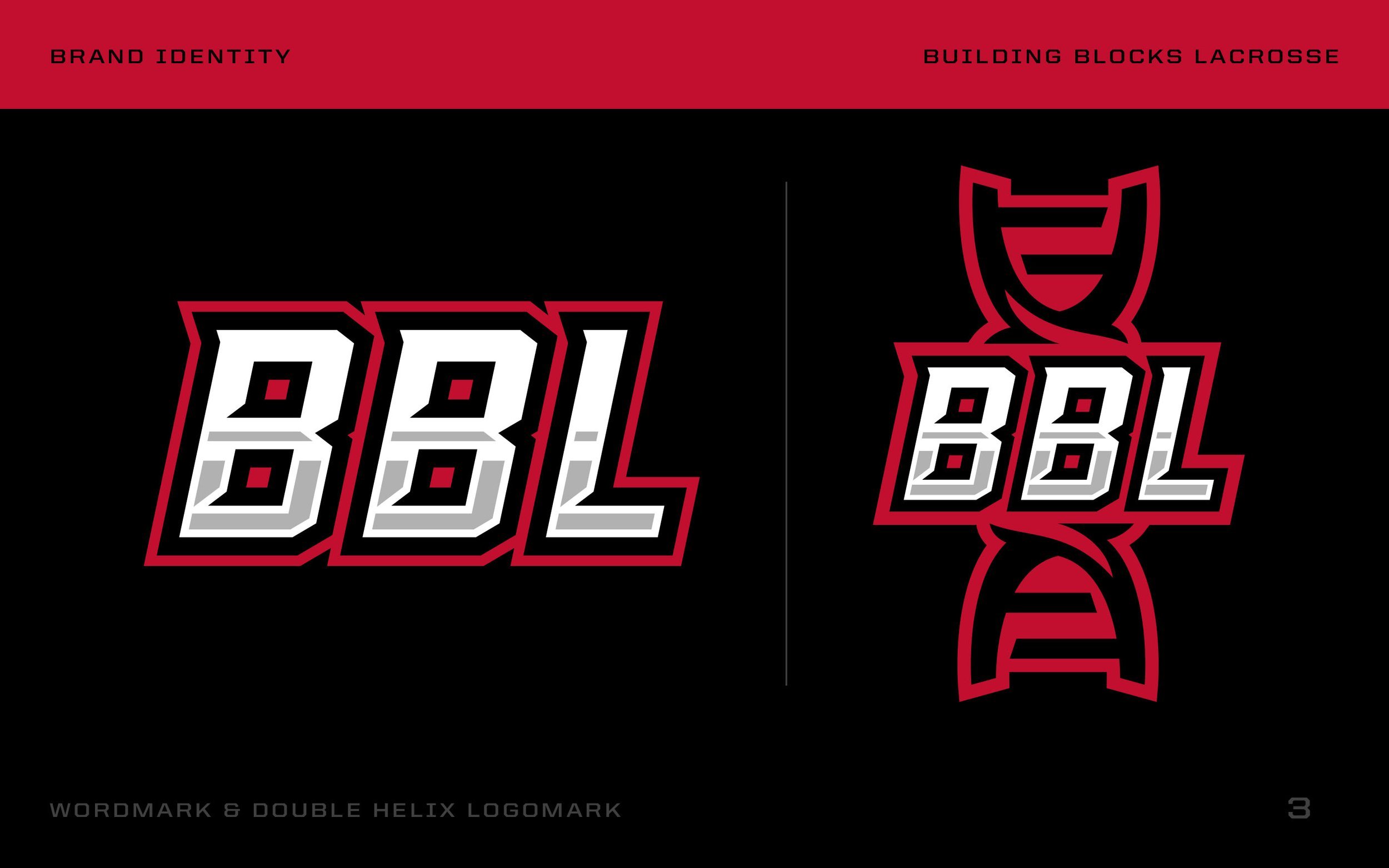
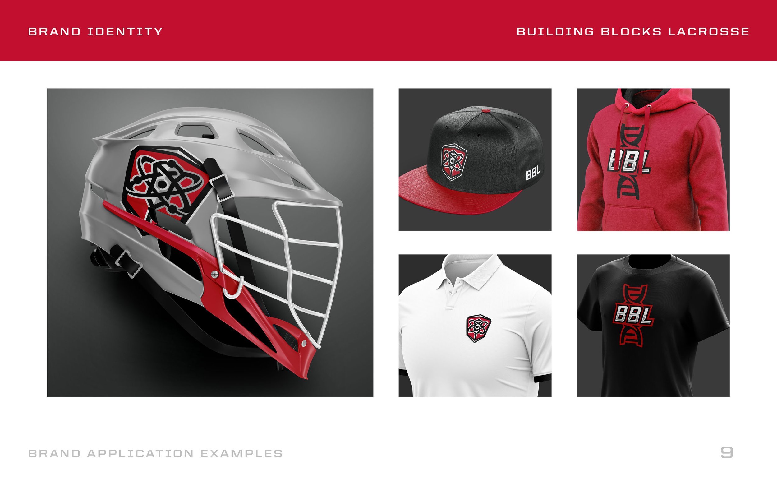
Custom ‘BBL’ Logo
Secondary Double Helix Logo
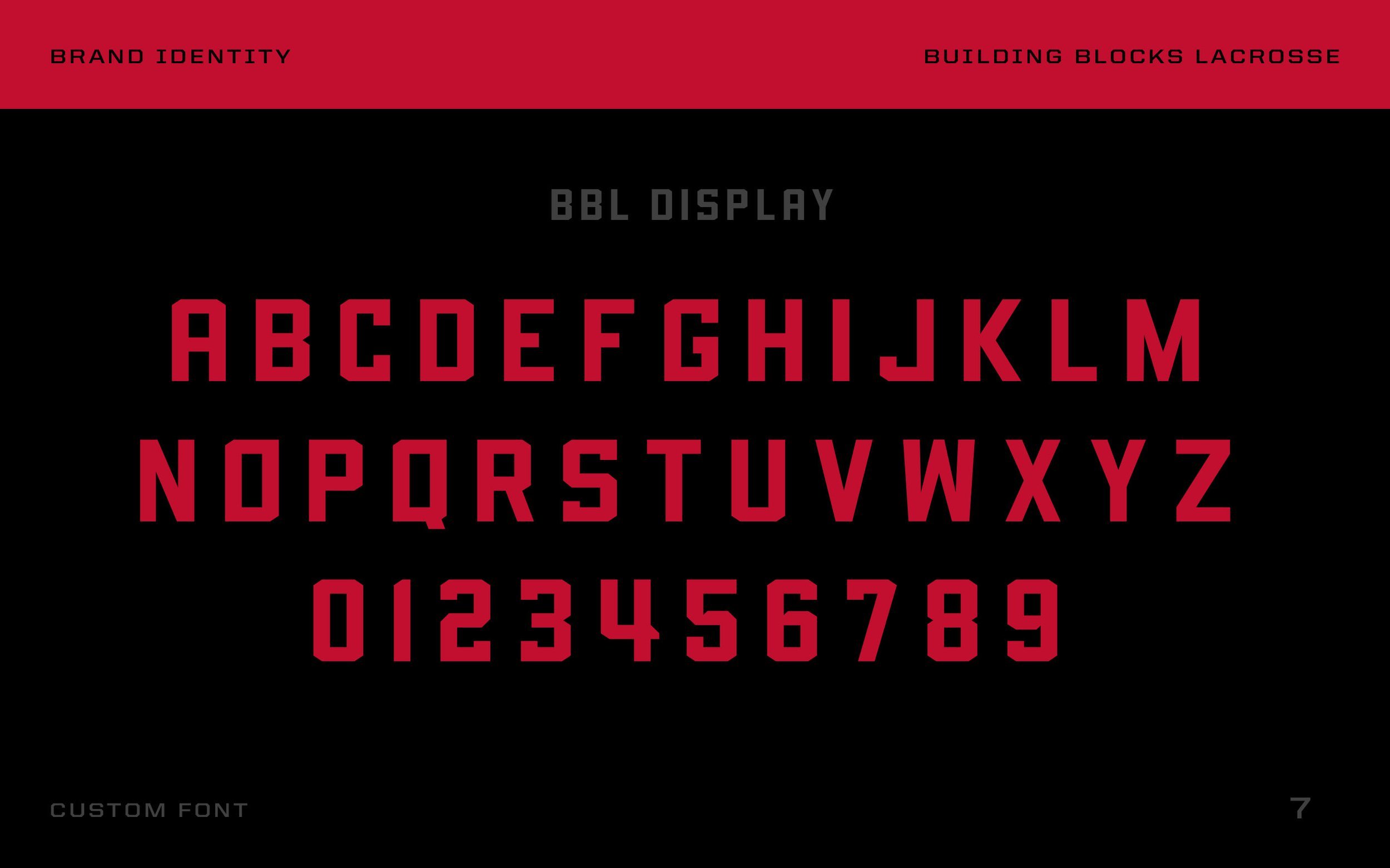
Custom Font System
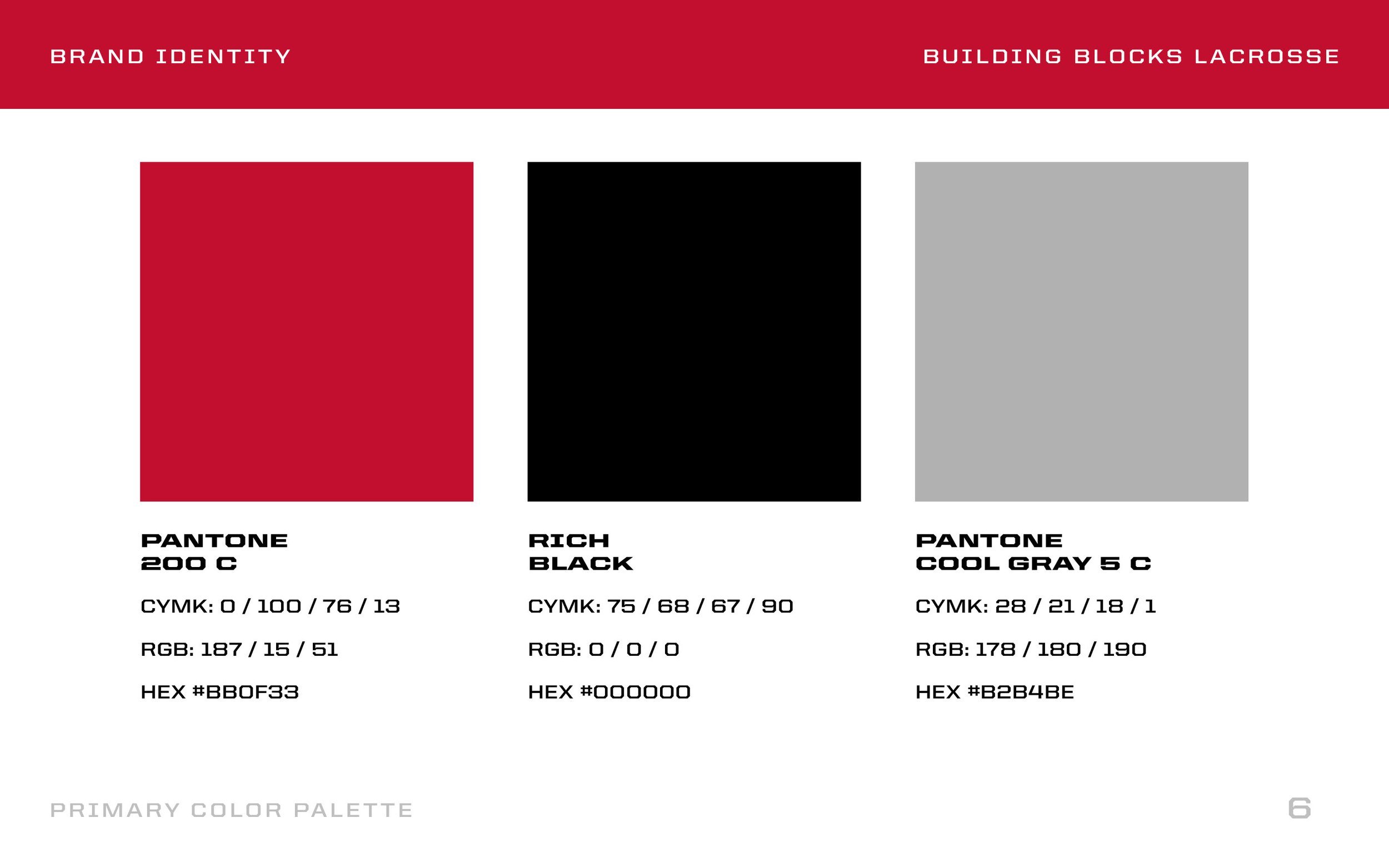
Brand Color Palette
Brand Style Guide
